Company news
Verified and Effortless: the story behind Zinit’s new brand
How we rebuilt our identity around what the platform actually does for a procurement team.
Identity designed by Andrey Klimenko and Olga Moskovtsev.
Procurement teams are being asked to cover more spend with the same people they had last year, and in most companies that request lands on a category manager who is already running sourcing events by hand, chasing supplier documents over email, and negotiating between other meetings. That is the person we built Zinit for, and our agents take over the long tail of that work, so the supplier search, the verification, the RFP and the negotiation all happen on the platform’s side, while the human comes back in for the parts that genuinely need a human, which are the final decision, compliance, and risk.
That is a serious promise to make to a CPO, and for a while our brand didn’t look like it was made by people who understood how serious. This is the story of how we changed that, and of why the change had as much to do with what the product does as with how it looks.
Underneath, Zinit is layered supplier verification, multi-stage tenders and a lot of machinery the buyer never has to see, and the brand had to speak about the result of all that rather than the mechanism.
“The power stays inside. What you see from the outside is simplicity. We are not selling the mechanism — we are selling confidence that it works.”
Why we needed a new brand
By the time we launched in the US, we were selling to procurement directors and C-level buyers at enterprise companies, and the identity we carried into those rooms had grown out of our startup years – a purple palette, a wordmark with no symbol of its own, and a product that lived outside any shared visual system. None of that had bothered us when we were small, but once our logo started appearing next to established procurement vendors on comparison slides, it became clear that it wasn’t giving us any recognition in a market where the first impression decides a lot, and it wasn’t holding up over the many hours a buyer spends inside the product either.
There was also another problem. Inside the platform, a user spends around fifteen minutes a day looking at numbers, statuses and risks, so the design needs to stay out of the way, whereas at conferences and in sales materials the brand has to get through a wall of competitors who all speak in the same cool blues. The old identity could only really do one of those things, and we needed an identity that could move between them comfortably.
Stan Moskovtsev, our CPO, started the project and set the brief as a system rather than a logo: one visual language for the investor deck, the website, the product interface, the videos and the merch, which would stay calm where the work is happening and could be turned up where we need to be noticed.
We wrote the criteria down as a checklist: one system across product, site and deck; the two core words legible through the design rather than asserted in copy; and color, type and the character of the mark tied together tightly enough that everything else could be derived from them.
Two words
The first version of our core was “safe and useful.” It was honest, and it described the product well, but you can’t draw a mark or pick a color from it. After a lot of arguing, the pair that stuck was Verified and Effortless.
Verified is the part of our platform that a buyer has to be able to defend. It starts with our supplier database and everything we collect about the companies in it – what they make, where they operate, what capacity and certifications they hold, and how they have performed in previous events – because you can’t find a supplier that genuinely fits a customer’s need until you have that information, and good data is what makes the later negotiation worth having. Verification then runs in layers, so by the time a supplier is recommended for a specific RFP, the platform can show where each piece of information came from, who confirmed it and why this supplier fits this requirement better than one that merely matched a keyword. A category manager won’t accept a recommendation they can’t explain to their CFO, which is why we treat that traceability as a feature of the product and design around it.
Effortless is the sourcing event where Zinit does the work. The user doesn’t run the RFP themselves; they check in for their fifteen minutes, see what has moved, and make the decisions that are theirs to make, and everything complicated about the process is still happening, just on the platform’s side of the screen where they don’t have to carry it.
The pair also happens to speak to two different people, which we liked. A category manager who is tired of the routine hears Effortless first, and a CPO or CFO who answers for the decision with budget and reputation hears Verified first, so the same brand has a way in for both of them.
What that means for a procurement team
We spent a lot of time on those words because they describe a business outcome, and we wanted the brand to carry that outcome rather than a slogan.
When agents run the mechanics of a sourcing event, the cycle time changes completely. A sourcing cycle that used to stretch across months, mostly because people had to find time for each step, now closes in days or even hours, and the only steps that still take human time are the ones where a human is actually deciding something.
Once the team is no longer the bottleneck, more of the spend gets a proper sourcing event instead of a quiet renewal, and that is where the headcount conversation changes, because a team of the same size can put many more categories through real competition, in parallel, without anyone working a longer week.
When more spend goes through real competition among suppliers who have been verified to fit the need, the savings come from the competition itself rather than from a buyer squeezing one incumbent, because there are multiple qualified bidders, complete information on each of them, and a negotiation the agent runs consistently every time.
And because every result on the platform carries its own evidence, the credibility comes along with it. The CFO conversation gets shorter, the audit trail is already written, and the buyer doesn’t have to build trust in the number after the fact because the number arrived with its history attached. In procurement, speed, savings and trust have usually been traded against each other, and we built the platform so that a team doesn’t have to make that trade, which is the same thing we wanted the brand to communicate.
From the idea to the mark
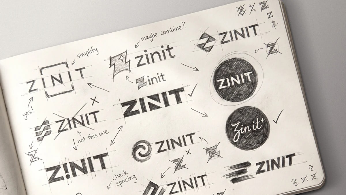
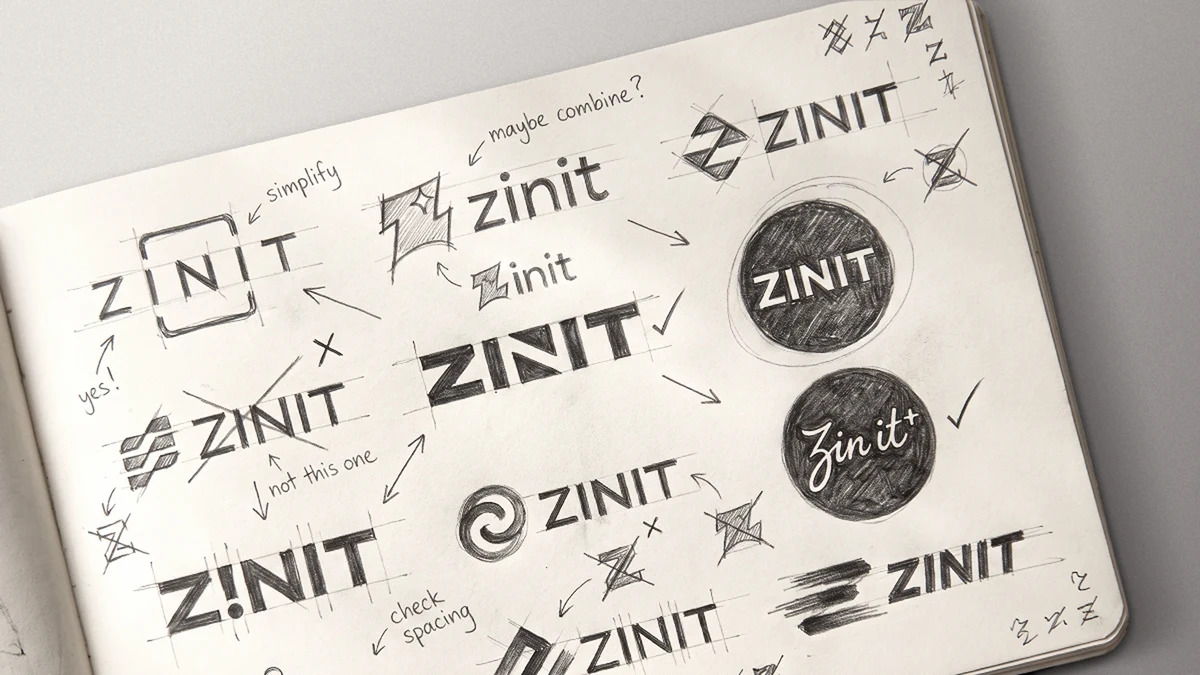
There were two ways to draw the brand. One was a pictogram that anyone would understand at a glance, and the trouble with pictograms is that the right ones already exist in a thousand versions and fit everyone equally. The other was to think in metaphor and let one simple shape carry several meanings. We took the second path, and a lot of the progress came from ruling things out: arrows and stripes, because that is the language of speed and every logistics company already speaks it; the spark, because it has become the stamp on anything AI-related; and lowercase, because it took the seriousness with it and our reader is a corporate buyer.
The answer came from the name itself. The old logo’s only distinctive feature was the dots over its two i’s, and working with those letters led us to a frame. A simple frame turns a row of letters into an object – a screen, a workspace, and also a scanner, the bounding box that finds the right supplier in a million.
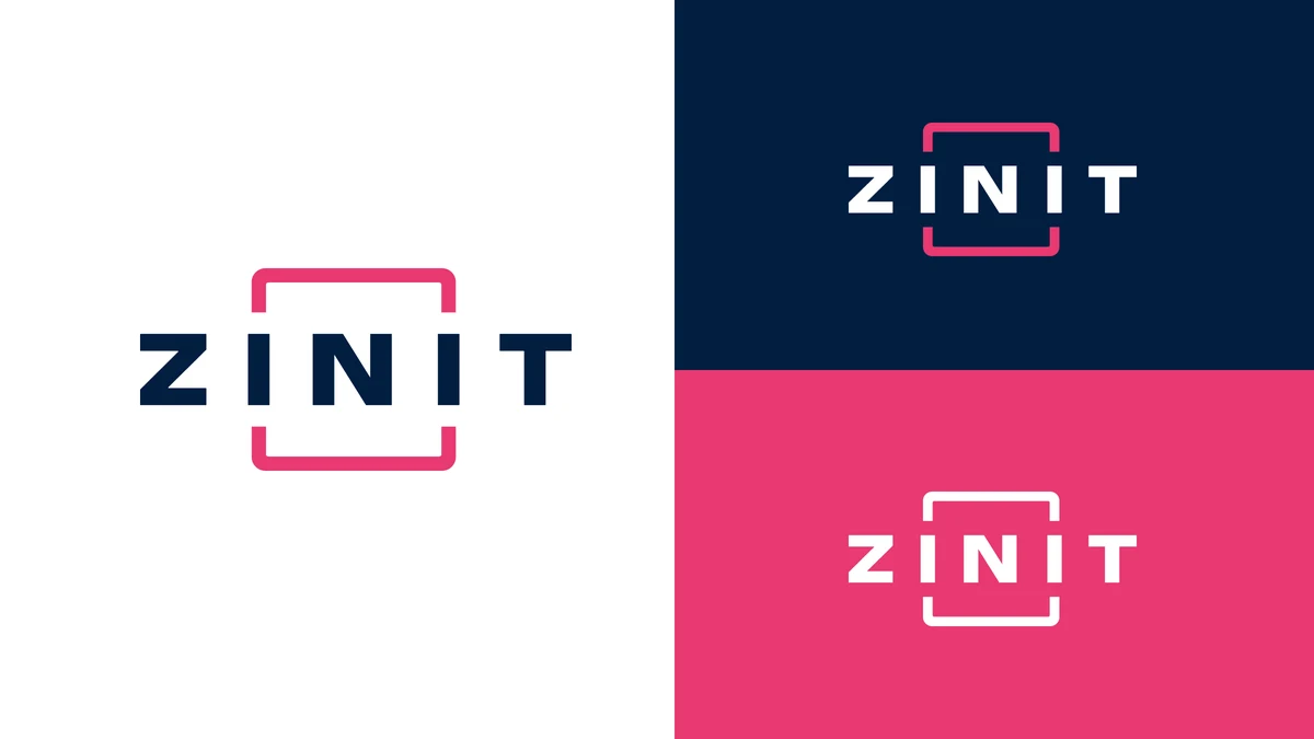
The final mark is ZINIT in capitals, widely spaced, with the middle letter set inside a thin frame made of four corners. The sides of the frame aren’t closed; there is a gap in the middle of each. The frame is a gesture of attention – pick one out of many and say “this one, and it’s checked” – which is exactly what the platform does when it sifts a supplier base, and the gaps keep the frame from turning into a lock, so it holds the letter without trapping it. We like that Verified shows up in the act of selecting and Effortless in how light the line is.
We tested it the hard way, by putting it in a row with competitor logos and checking whether it disappeared, and it held its own. The shape stays the same everywhere, and the tone changes with the surface, so it reads as graphic on a light background, more formal on navy, and quite loud on raspberry.
The simplicity is deliberate. The brighter the emotional idea inside a logo, the shorter it tends to live, and the marks that survive for decades usually hold several meanings in a very plain shape.
Color and type
The palette was built as an argument, and we looked at four territories before settling: a light “safe” option, a high-contrast one, a warm one, and a purple that carried over from the old brand.
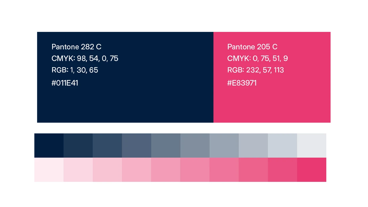
The base is a deep navy, #011E41, Pantone 282 C, dense enough to read as expensive and calm on a large surface. It carries Verified – the seriousness, the depth, the sense that someone stands behind the system.
The accent is raspberry, #E83971, Pantone 205 C. Partly an engineering choice, because it is one of the few colors that reads equally well on light and dark backgrounds, and partly a category choice, because nobody in procurement software uses it, so the brand becomes recognizable from across a room. Next to the navy it looks confident, and in the system it carries Effortless, the color of the moment when something comes together: the request is assembled, the supplier is found, the RFP is awarded. Because it stands for that moment, we are careful with how much of it we use. Inside the product, raspberry lights up once per screen, at the moment of a result, and never as a fill, while in marketing the same palette can be as loud as we need it to be.
For type we wanted one family that works in the interface, in a presentation and on a business card, across markets and alphabets. We chose Inter for text and functional elements and Inter Display for large headlines and decks.
The composition rule follows from the core, with Verified showing up in the details and Effortless in the layout. From a distance a page reads calmly, with a structured grid, wide margins and a lot of air, and up close every element is measured – exact spacing, one disciplined accent, nothing accidental.
“Zin it”
Early in research someone noticed the name works as a verb, and it has stayed in our headlines since: how top CPOs Zin their spend, stop Excel-ing your indirect spend, and so on. It turns the brand name into a description of what a customer does with their procurement, and it is a small reminder of where we want to take the product – a whole sourcing cycle that stops being a long process and becomes something closer to a single and simple action.
A system, not a logo
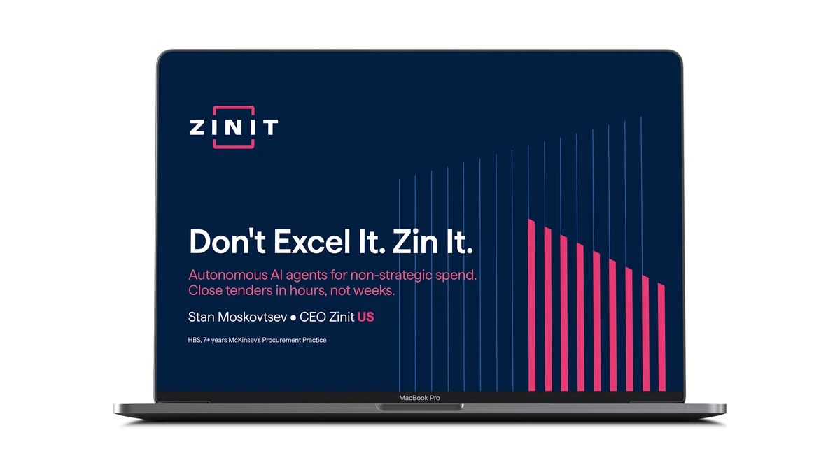
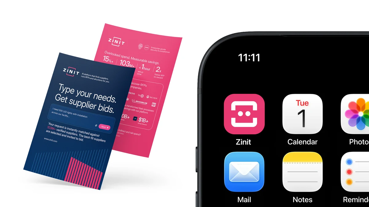
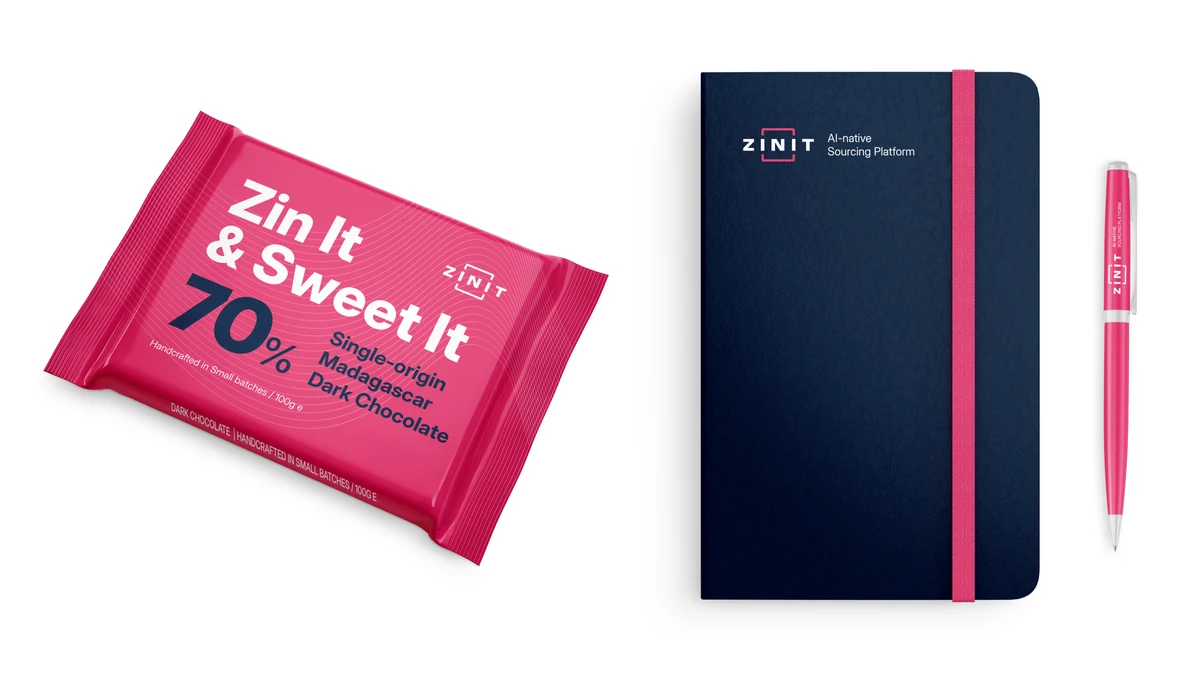
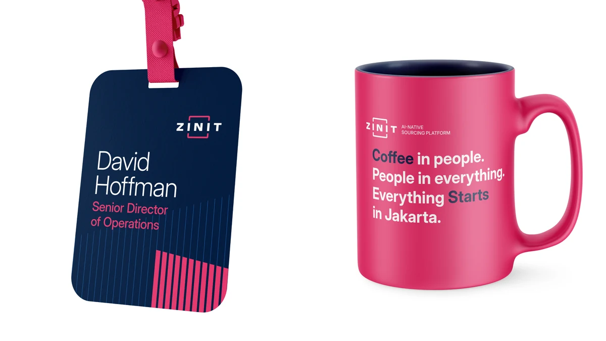
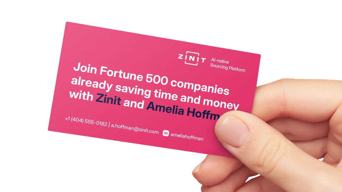
Outside the product, the system is at full volume: the website and the investor deck sit on dense navy fields with raspberry accents and headlines built on verbs, and the app icon, a raspberry tile with the white frame, picks itself out among hundreds on a phone screen. Inside the product the same system settles down, with a neutral base and the accent reserved for the moment of a result. Merch and social follow the same discipline, because we treat the palette as a tool rather than decoration, and that is what keeps the brand recognizable whether it is on a mug or in a boardroom.
How it was made
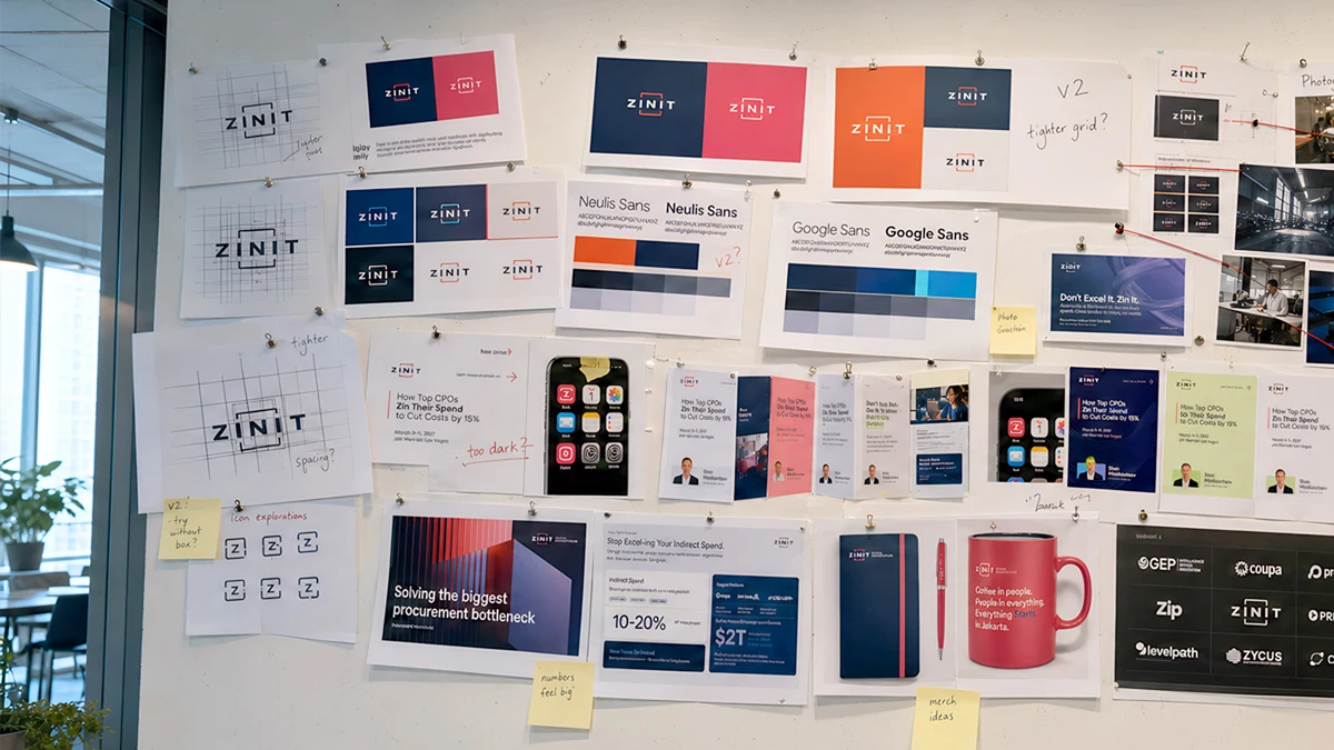
We are an AI-native company, and we try to hold ourselves to the same expectations we set for our customers. So instead of hiring an agency, two designers on our team, both of whom came to us from international branding agencies, built the whole system in about a month, working in one chat with founders who had launched brands in several markets before, and the decisions got made in direct conversation with room to argue until something was right. That worked because everyone involved understood the product, the procurement world and the markets we sell in. Once the identity kit was done, the same team carried it onto the website and every social channel in two days.
Where it goes from here
A month after we started, the kit was in use, the site and the social channels were live on the new system and the current materials were gathered in one place for the whole company. The constants are set – mark, color, type – and the rest is growing on top of them: investor presentations, an updated interface and corporate site, merch, and, if we get it right, a mascot and a less routine feeling inside the platform itself.
What we are happiest about is that the brand now makes the same promise the product makes, which is that the hardest part of procurement stays inside the platform while the customer gets faster cycles, more spend under competition, savings they can stand behind, and a level of trust they didn’t have to work for.
More from the Journal: all articles · company news